Elevating the IKE’s Brand for Big Box Line Review
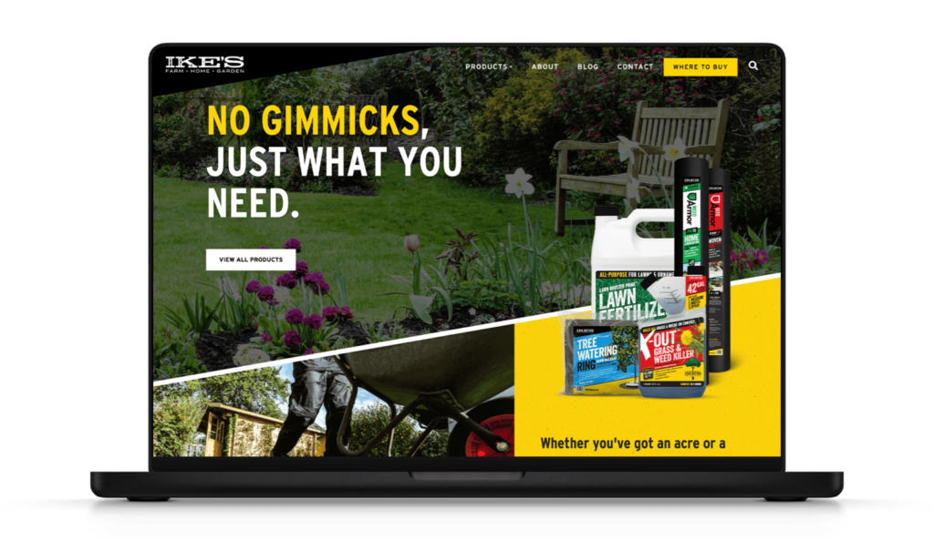
The IKE’s team came to us to help them with a brand lift and line review support at Home Depot, Lowe’s, and Tractor Supply. Our strategy targeted homeowners with acres and leveraged online and digital media tactics to reach our target audiences.
The product line features concentrated herbicides, insecticides, fungicides, fertilizers, and specialty products, and their bottle design is essentially a tool that has a handy second reservoir for the user—taking the guesswork out of the measurement process. A challenge we needed to address is that concentrates have the highest walk-away rate at point of sale in the lawn and garden category. Why? Many people avoid these products due to the fear of user error, the potential impact of the product on every plant in their lawn and garden, and the fact that it’s not ready-to-use like many cheaper alternatives.
But here’s the kicker—one quart-size bottle of IKE’S X-OUT™ GRASS & WEED KILLER is the equivalent of 42 gallons of product once mixed. This means that for around $28 more, you essentially get 41 more gallons than the average competitor’s ready-to-use product. That’s over $300 in savings in the long run!
There’s a lot to digest from a product and cost-benefit standpoint, but the math above was the foundation of the value we had to communicate to our audiences. And on top of that, we needed to educate customers on how the product works and how to use the measurement tool. To address this, we took IKE’s through a rebrand and redesign of its product packaging and messaging.
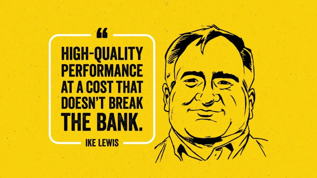
I MEAN, HIS NAME IS ON THE PACKAGE.
When it comes to brand refresh exercises, it’s awesome to have a solid foundation to build off and find creative inspiration for. When there’s a great product, a compelling story, and relatable people, you have an amazing jump-off point. Growing up on a family farm in North Carolina, Ike Lewis (yep, Ike is a real person) turned his love of working the soil into a life-long career in the agricultural industry. Gardening was his world, and he knew it better than anyone.
From a brand strategy point of view, our favorite trait of Ike was that he simply told it like it was. “Don’t buy products that are mostly water in a bottle.” It’s a bold, honest statement from the man himself about competitive offerings. We decided early on to lean heavily on this in our work. Creatively, our biggest challenge was weaving this wholesome, honest “everyman” into the brand—while also respecting the legacy of the brand and modernizing its visual system.
Oh yeah, and it had to be scalable. As we started to dig into the project, we quickly learned that new product lines were being added, and we had to create a brand that could adapt on the fly.
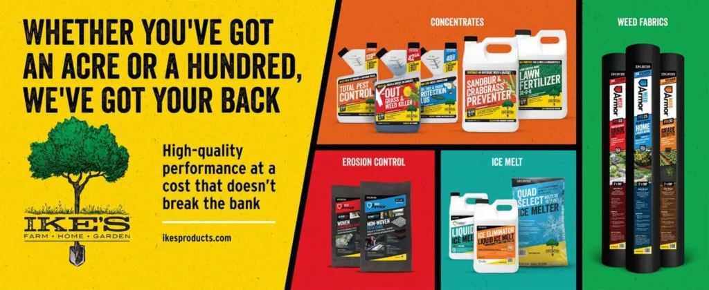
STRAIGHTFORWARD? YES. CONFIDENT? HELL YES.
Our messaging strategy was crafted so that shoppers would quickly understand what the product is, how to use it, and where. We believed from the get-go that the refreshed packaging should read as a trusted voice—like Ike Lewis himself was communicating the value of the purchase to the customer. There was a balance for the voice, though. Pushing the voice too far made it feel disingenuous, cocky, and arrogant. That’s not Ike.
Ike believed people should be particular about the products they choose. He thought people should expect uncompromising products that deliver exactly what they need and with no gimmicks attached. Products that give you the freedom to grow your self-driven ambition into something greater, and products that offer “high-quality performance at a cost that doesn’t break the bank.” This brand is speaking to customers who don’t want a compromised product, even if that means they have to do a little work.
Again, there’s a careful balance to this tone. The brand needed to be straightforward enough for a typical customer to easily understand what the product is and how to use it, and then it needed a little character from Ike to lend the product a sense of confidence. “Our products are more effective than everything else on these shelves, and don’t worry, they’re easy to use.”

A LOOK THAT CATCHES THE EYE
It nicely fell together visually through a proof of concept and brand alignment presentation deck shared with the client. Floods of in-your-face color, impactful statements with typography that celebrate getting your hands dirty, practical and relatable imagery, and just a hint of illustration give the brand a human touch. With our brand voice, art direction, and messaging established and client-approved, the next step was to activate the creative at point of sale.
“We have to be disruptive at point of sale!” An EPIC philosophy as it applies to package design are words that get us started with every blank canvas. It’s not just the visuals either, it’s what you say, and more importantly, how you say it.
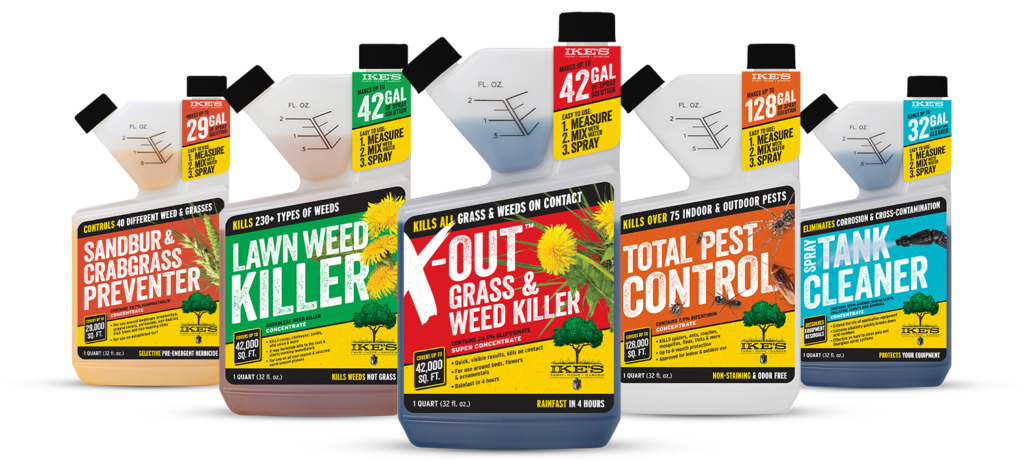
PACKAGE DESIGN THAT LEAVES NO DOUBT
With the package design, it was all about continuing the straightforward message, and making it as easy for the consumer as possible.
- Association of a color to each product.
- Bold typography that communicates the product name.
- Neck label that highlights the value of not only the specific product and concentrates, but also communicates how easy they are to use.
- Showing exactly what each package addresses, for example, by putting crabgrass on the crabgrass product or specific insects on the insect killer.
Ike’s voice was in the back of our heads throughout the execution, and the result was a bold, confident, and educational visual identity system with a ton of personality.
