
When Carry-On Trailer reached out for support with a rebrand, we knew the request was a perfect fit because we know their customers so well. Because we’ve done decades of work in the landscape and home DIY industries, we could put ourselves in the minds of people who need to haul equipment and materials for work or for to-do lists.
But first, we needed to understand the Carry-On brand’s unique history and the vision for its future.
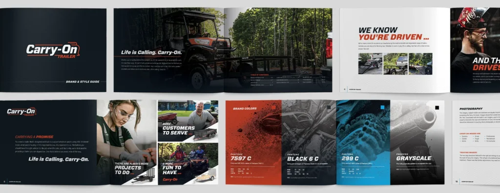
Logo Update
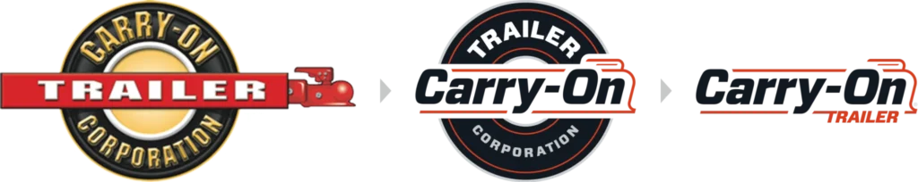
When we tackle a brand refresh, we always want to make sure it has longevity and versatility. It needs to have the same power and impact across various forms of media. But as is sometimes the case, the client asked for us to pay homage to the existing brand with the new logo.
Over the years, when navigating conversations about brand updates, we have learned the art of “telling someone their baby is ugly” (one of our Chief Creative Officer Joe Rogge’s favorite phrases). We bring a fresh perspective to them and discuss clearly and as objectively as possible what we think works and doesn’t work with the logo. The intent is to set the stage for candid, open conversations, which certainly support our SCRAPPY, HONEST, KIND values. And, truly, this baby wasn’t ugly per se; it was a bit overcomplicated and too loud for the brand’s aspirations.
One of the first opportunities we saw was to flip the hierarchy and emphasize “Carry-On” to support the brand name over the product. We initiated a few changes to modernize the mark: remove the dimensionality, flatten and simplify the colors, and update the typography.
Conceptually, we wanted to make the trailer hitch motif less literal, but rather a more abstract representation to create motion in the mark. We worked with the client to take it further by removing “CORPORATION” and reconsidering the location of “TRAILER.”
Using this framework, we also considered developing a sub-branding system that would act as a catch-all for brand assets. Examples include: Carry-On RAMPS, TOWING, SECURITY, etc.

LIFE IS CALLING. CARRY-ON.
Believe it or not, the logo portion of the Carry-On rebrand was the easy part – the real “meat and potatoes” was developing a targeted messaging strategy to support their vision. When we started, their tagline was more of what we would consider a vision statement: “A Trailer in Every Driveway.”
Ambitious? Yes. Attainable? Probably not. Something to work with? Absolutely. We knew the opportunity was not EVERY driveway, it was to get a Carry-On Trailer in the RIGHT driveways. We needed to figure out a messaging strategy to speak to their audience(s), rather than talk at the general public.
Working with our subject matter experts at Carry-On, we quickly identified a position that spoke to our primary audiences: “There are always more projects to do, more customers to serve, and more fun to have.” This also started to educate the lifestyle value proposition surrounding owning (and using) a Carry-On Trailer:
From the moment you hitch up and drive away until the trip is done—day in and day out—a Carry-On trailer creates possibilities and allows you to tackle any task. Life is calling. Carry-On.
The narrative is about the combination of quality, accessibility, and dependability when the user needs it most. Carry-On Trailer supports the lifestyle of trailer owners and is there alongside them for the ride, no matter where it takes them.
You need a trailer that’s designed and built to support whatever you’re using it for. It doesn’t matter what you’re hauling—if it’s important to you, it’s important to us.
BUILDING ON THE FOUNDATION.
At this point, we have a new logo and messaging strategy to “relaunch” the brand. Our next step was to activate them with the development of the Carry-On brand guide.
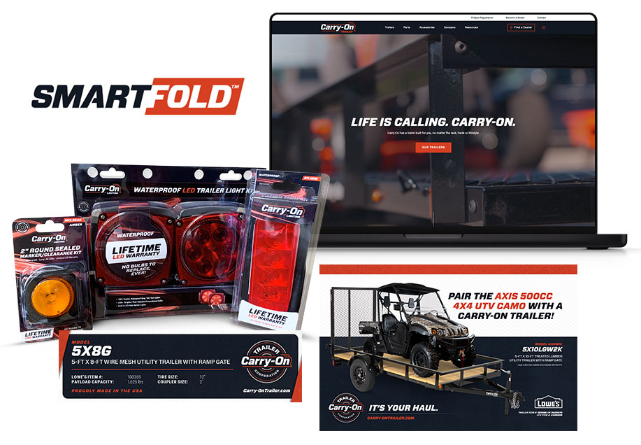
Carry-On’s rebrand was one of many that we’re proud of and has built a long-lasting relationship with our client. Below are a few examples of other brand assets based on our initial work: