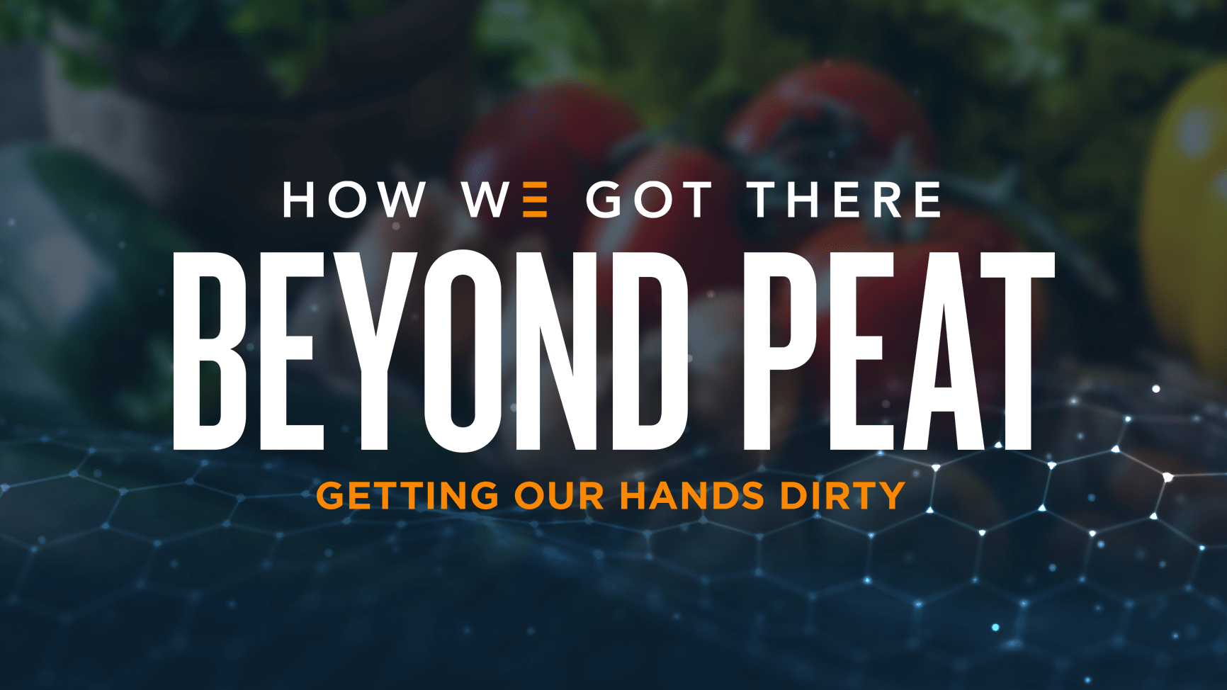
Getting Our Hands Dirty

The beauty of soil packaging + messaging
Let’s be honest, we’ve been at this for a little while. You know, 34 years of marketing in the turf and ornamental industry. We’ve done dozens of line reviews for big-box retail distribution. In fact, our Chief Creative Officer Joe Rogge recently wrote a blog about how to succeed in a line review. The point is, we’ve seen a thing or two in this industry. So when an old friend and long-standing client in the industry came to us and asked us to do some branding and packaging for a new consumer soil line, we thought we had it in the bag … literally.
We know that the important things to focus on with a new lawn and garden brand are to help the products stand out, and be disruptive at the point of sale. When it comes to soil—which some people may think is just dirt—it can be more difficult. You can highlight the different blends, composition, or quality ingredients. Plus, you can highlight the story of the brand and how it yields excellent results. But we were in for a surprise when it came to this brand—it was truly revolutionary.
The Curveball
We talked to the client and went through the basics of the request: timeline, deliverables, and everything in between. At that time—2020—the biggest challenge for all products was that we were in the thick of the pandemic, with many retailers temporarily eliminating line reviews altogether. Somehow, our client managed to get an opportunity to present this new soil brand to Walmart. It’s an innovative product and technology that dramatically increases moisture retention in soil. And the kicker: it’s a peat-free, organic, professional-grade, sustainable, technology exclusive to the client and its local manufacturers. They called it Beyond Peat™, featuring Bio-Fiber™ Technology. We needed to do some research.
Peat-free? Sustainable? Isn’t all soil renewable and sustainable? We suddenly realized that this wasn’t just any soil branding and packaging project. This was a revolutionary new product, and there was (truly) nothing like it on the market.
It turns out that peat, which is used in soil mixes to increase its water-retention capacity, is actually a non-renewable resource that’s mined from peat bogs—many of which are in Canada and the UK—require heavy machinery and mining equipment, and the peat takes hundreds of years to regrow. Then they have to ship the peat across the world and put it into the soil mixes. It’s becoming more and more clear that peat is not the ideal ingredient. But don’t take it from us, even the New York Times says so.
But this product uses a proprietary process that extracts fibers from horticultural residuals (like manure and other bio-digested materials) to take the place of peat, making it more sustainable and environmentally friendly.
Whew … that’s a big story to tell on a soil package.
The Messaging
Because the peat-free story was so crucial to the brand, we had to start there. It was new, so we not only had to introduce the solution, for most people we also had to introduce the problem. We didn’t have the space to say why peat was problematic, and we also didn’t want to be negative right out of the gate. So we instead emphasized the benefits of a peat alternative, using words and phrases like “peat-free,” “sustainable,” “locally sourced,” and “100% renewable.”
The other challenge is that, when you’re telling the story of an alternative to or a substitute for the norm, you have to reassure the consumer that they’re still going to get the same results. It’s like every diet soda out there: “It tastes just like the real thing!” We leaned into that with statements like:
New Soil Technology. Impressive Results.”
It showcases a new and exciting peat-free technology, while assuring the customer that they’re going to get—and should expect—strong, healthy plants.
We drove the point home with the details. As people dug into the brand, we supported it with stats that the BioFiber Technology helps the soil to hold seven times its weight in water, and produces “longer, stronger fibers” for the soil.
We honestly didn’t even tell the story of the problems with peat unless we had to, because we wanted to say what the product DID, not what it didn’t do. It was more important to say that it was beyond peat, not without peat.
Now that’s more to wrap your head around than just dirt in a bag, isn’t it?
The Look
Now for the fun part (if you ask our design team): establishing a visual hierarchy to make the product packaging disruptive in a noisy lawn and garden point-of-sale experience.
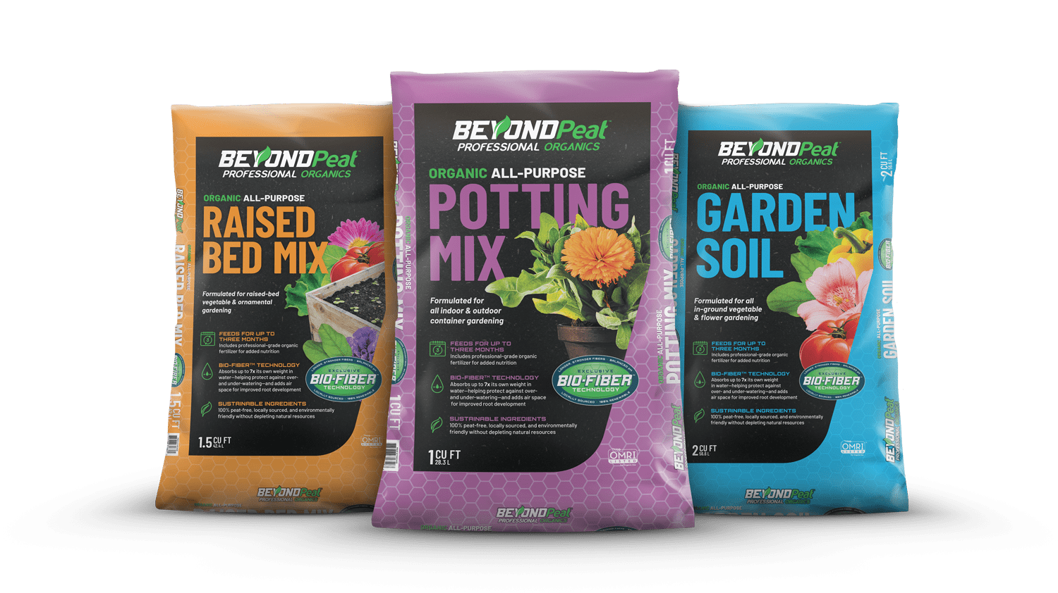
The biggest design challenge was how to visually communicate the product value proposition. Without giving away ALL the ingredients of the secret sauce, there were fundamental principles and design hierarchy that made the visual strategy work:
- The leaf in the Beyond Peat Professional Organics mark starts to tell the story.
- It’s supported by a vibrant color palette with stopping power.
- The typography is easy to read and LOUD. (They have to know what they’re buying, after all.).
- Iconography was developed to pair with the primary callouts.
This was a baseline delivery of content to create a physical user experience … what we do on virtually every packaging project.
But then we paired it with a design element built and considered early in the messaging strategy: THE BADGE.
The badge is a design element that functions as the Cliff Notes version of our value proposition. It’s a visualization of the technology—longer, stronger fibers; balanced pH; local sourcing; and the fact that it is 100% renewable—all with a techy flair. It’s a lot to get across in a single graphic, but we found it to be a successful way to communicate what our technology is, what it does, and why it’s better. We quickly realized that the badge became just as important as the logo in support materials—if you pair it with the logo and URL, it tells the entire Beyond Peat story.
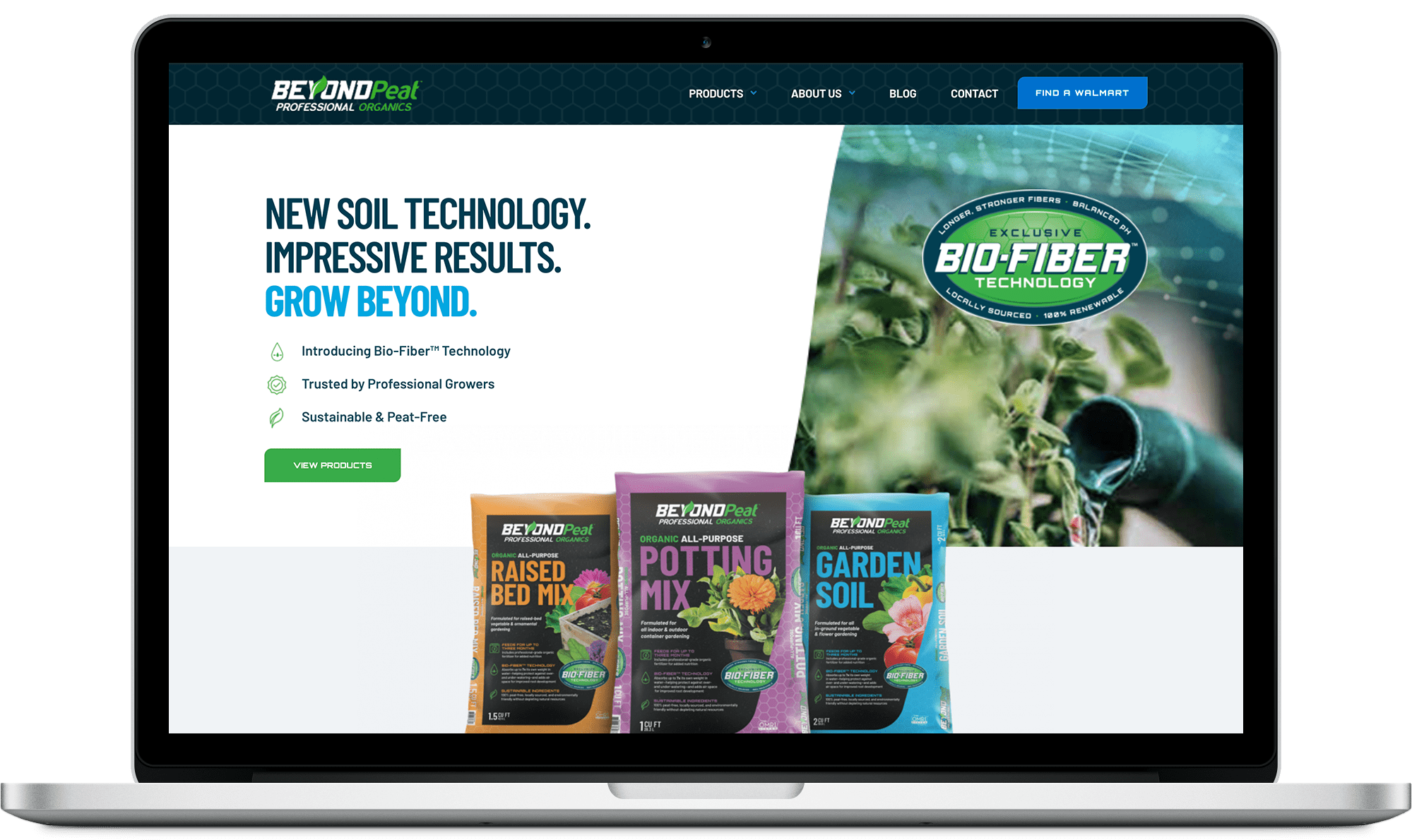
The foundational art direction of the packages was then translated into all deliverables: website, social, video, retailer support, you name it. Using our curated library of lifestyle photography, product photos, b-roll from a video shoot, and brand design elements, the sprint was on to support the brand however and wherever we could.
In addition to the website, we launched a social media strategy, including an Instagram and Facebook page, as well as a blog with practical gardening tips. To earn clout in the lawn and garden community, we partnered with key influencers who used the products in their gardens, showing how it works and helping to authentically tell the sustainability story. Finally, we earned PR placements in some of the biggest home and garden publications in the country, including Garden Gate and This Old House magazines. It was a blitz.
The Impact
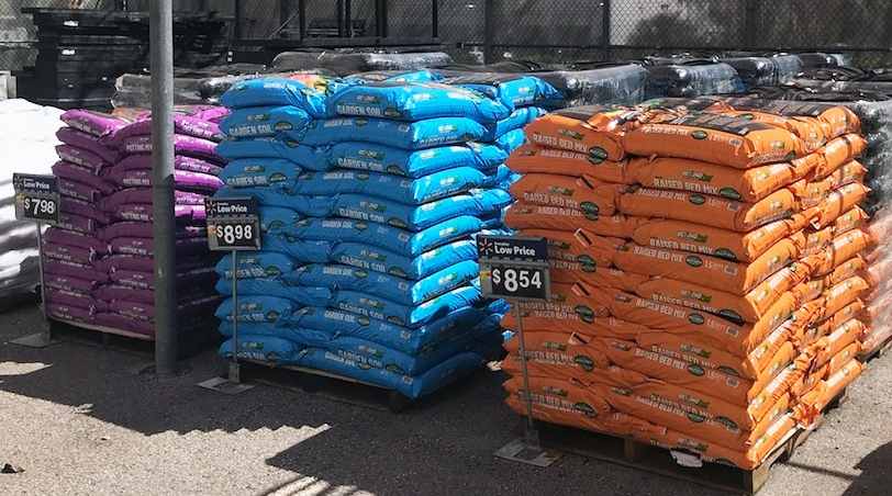
Thanks to the integrated market penetration strategy combined with efficient distribution logistics, Walmart sold out of Beyond Peat soil mixes across the country. With Beyond Peat and Bio-Fiber Technology now firmly in the marketplace, Beyond Peat is now expanding to other retailers, and exploring other product extensions, including a Bio-Fiber soil conditioner.
And here at EPIC: we once again discovered there is always more to learn, and there are more innovations to highlight and new stories to be told … even in spaces we’ve been in for years.
Recommended